Case Study
Redesign of Motorola.com
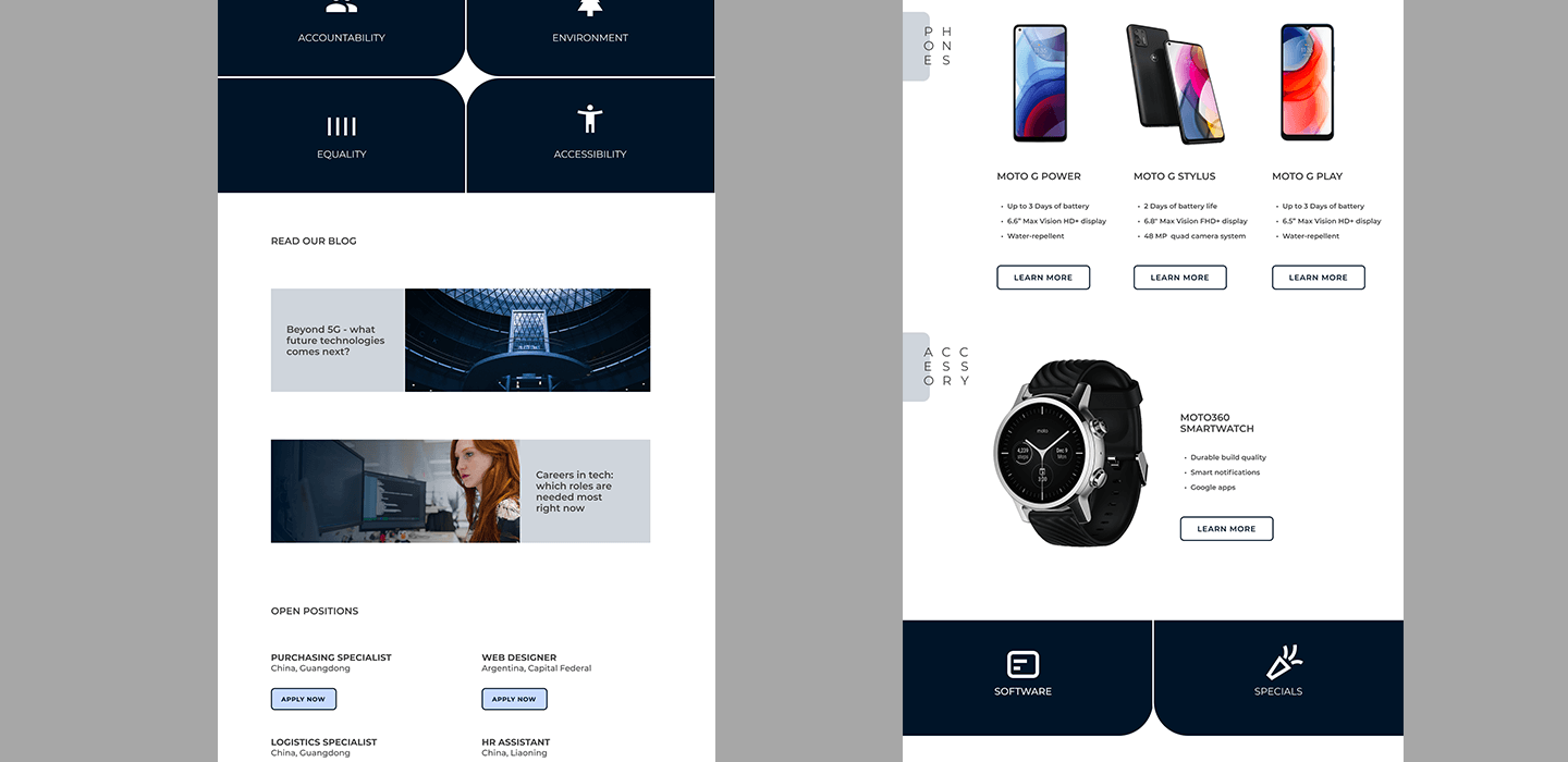
Summary
As the mobile phone industry matures, Motorola seems to try to catch up with its main competitors. I wanted to highlight the problems that can arise when usability is not the highest determining factor in the corporate decision making. In this example I'll demonstrate some of the poor decisions made on their website and how they could be improved upon.
Role
UX/UI design
Information architecture

Insight
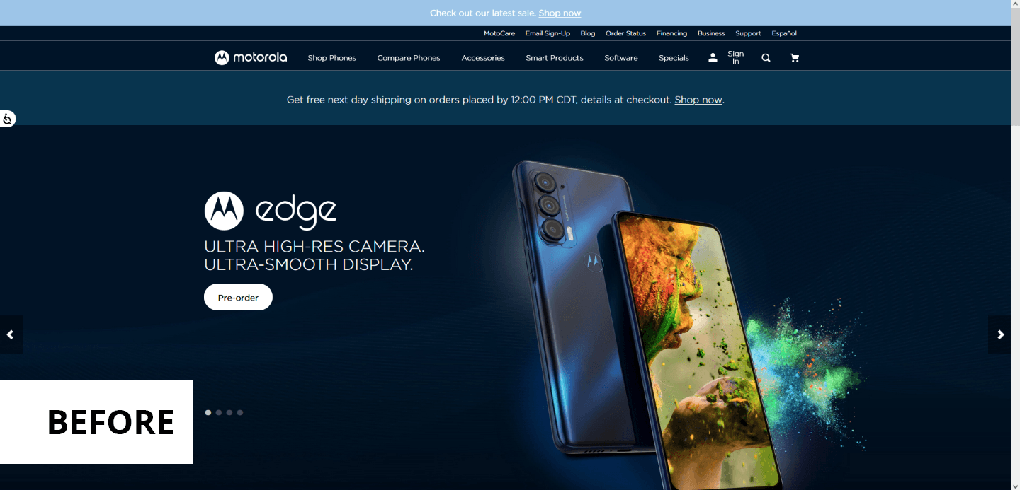
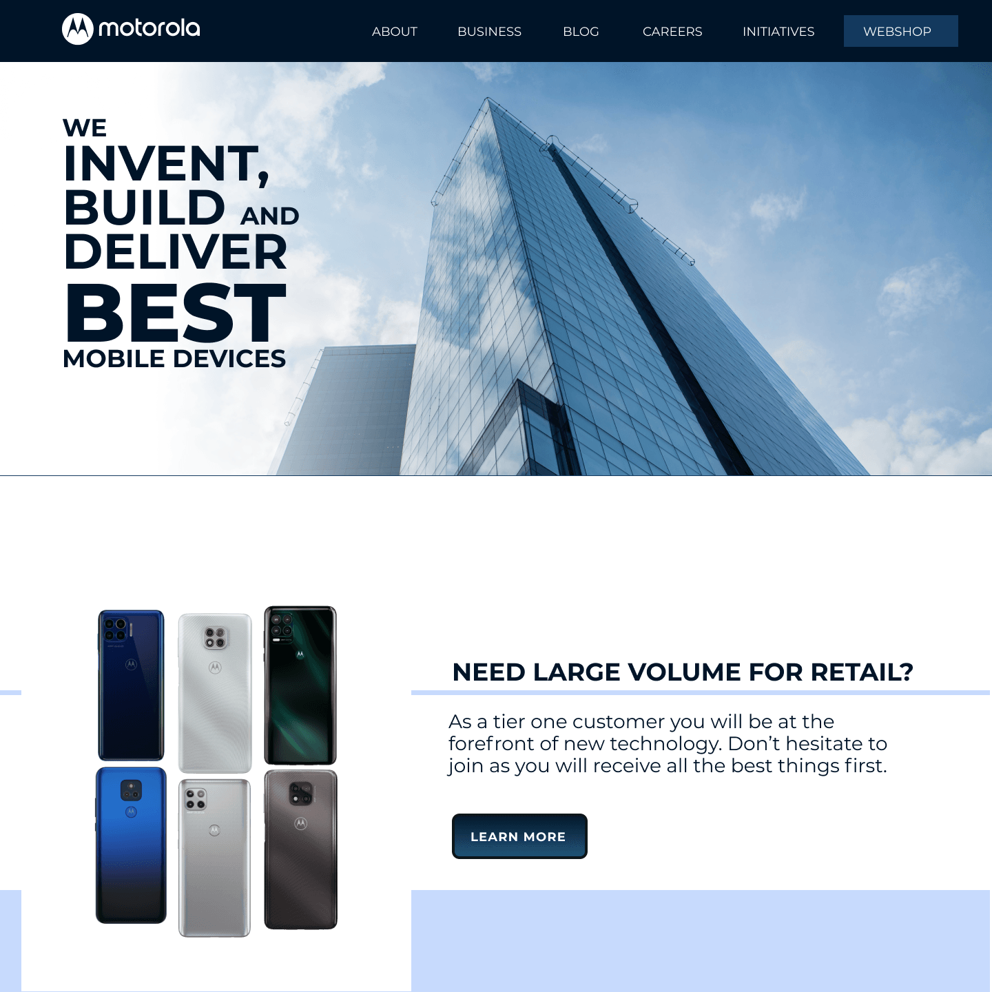
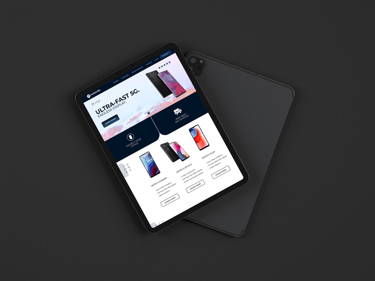
Below you can see their current website styled in a dark blue theme. Immediately it can be said that this website looks pretty chaotic with huge amount of navigation links making it hard for anyone to find what they are looking for. And this is exactly the experience customers looking for a phone don't want. To make it more simple I would have a separate company website as the use case is different for customer and 3rd party contacts interested of the company.

Solution
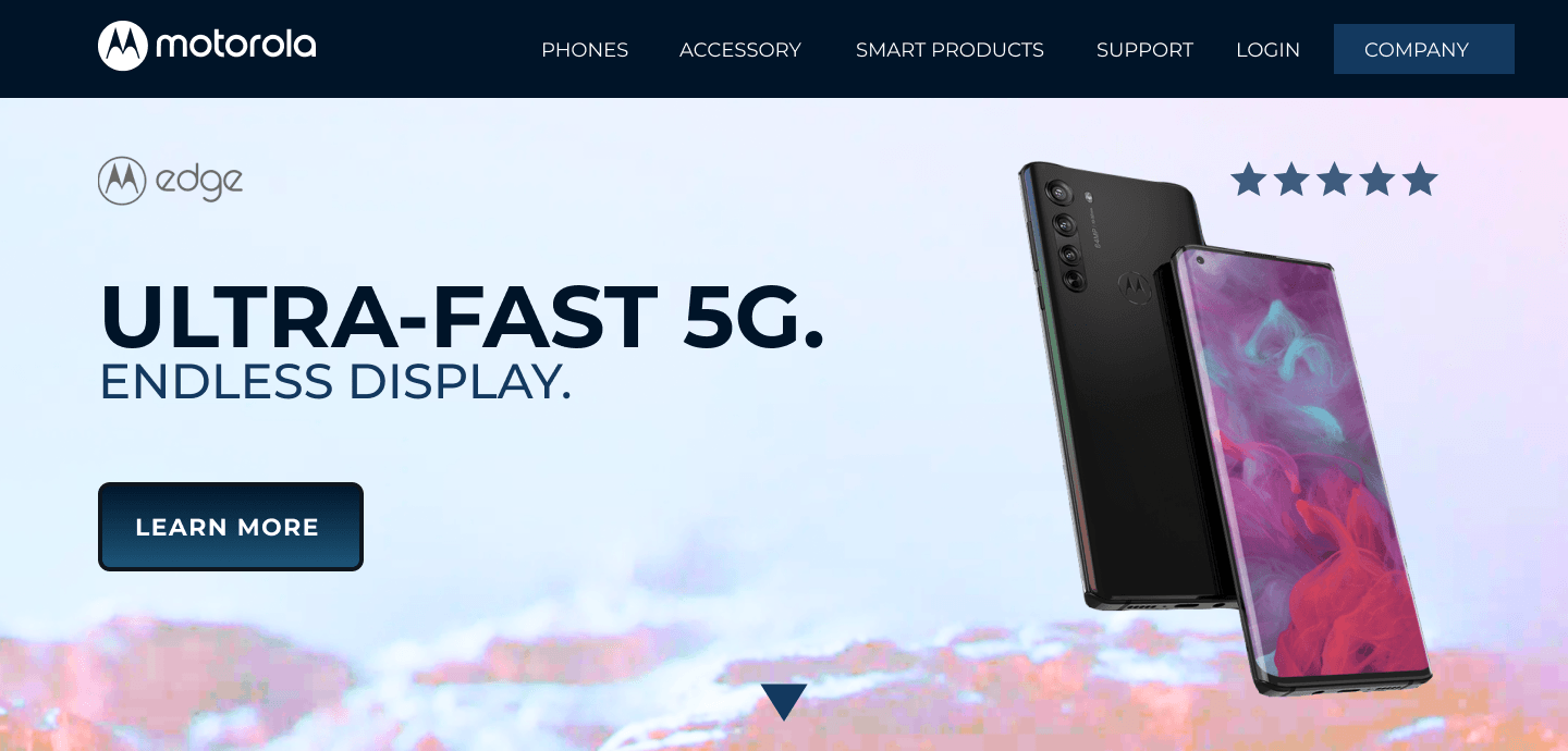
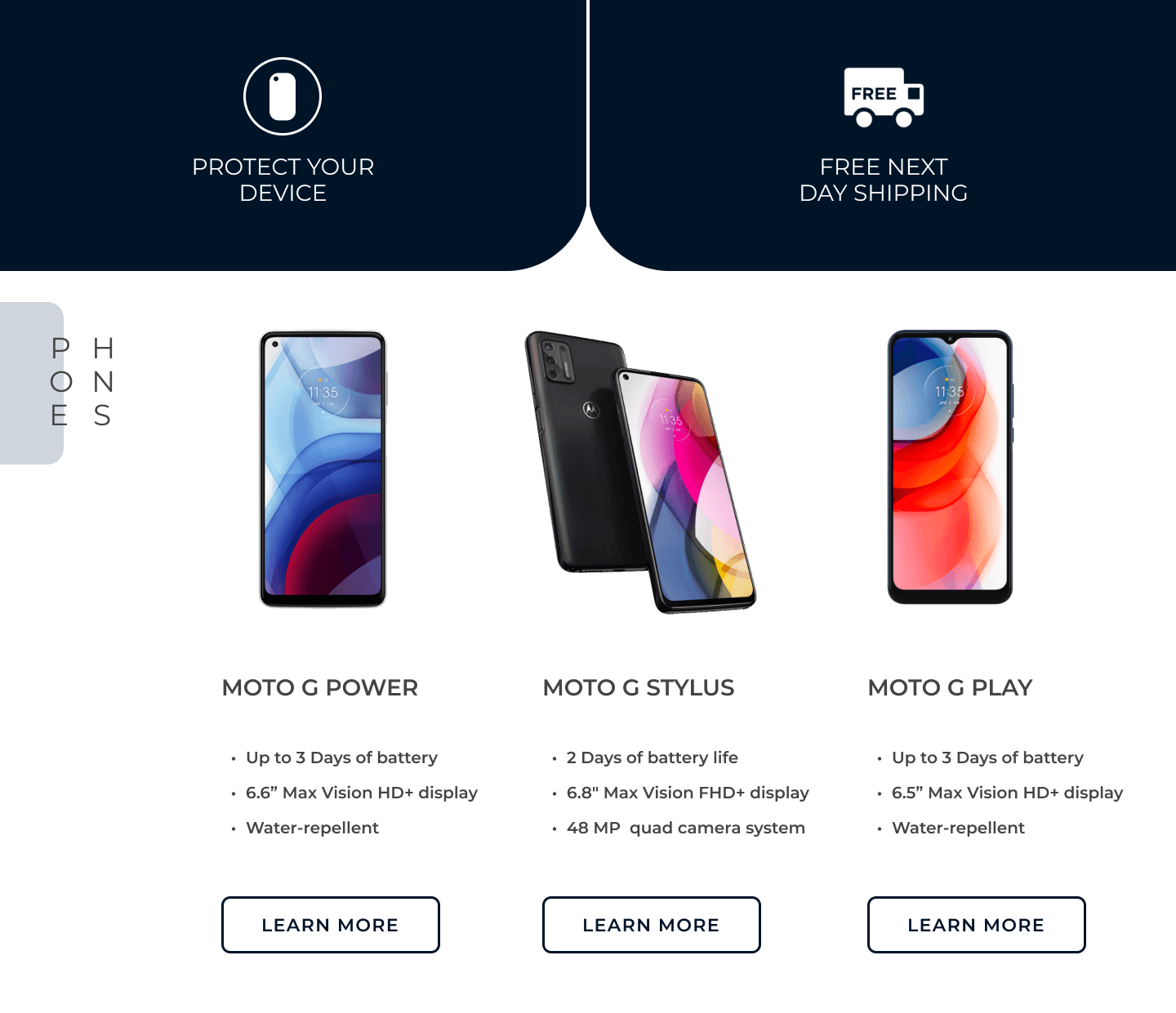
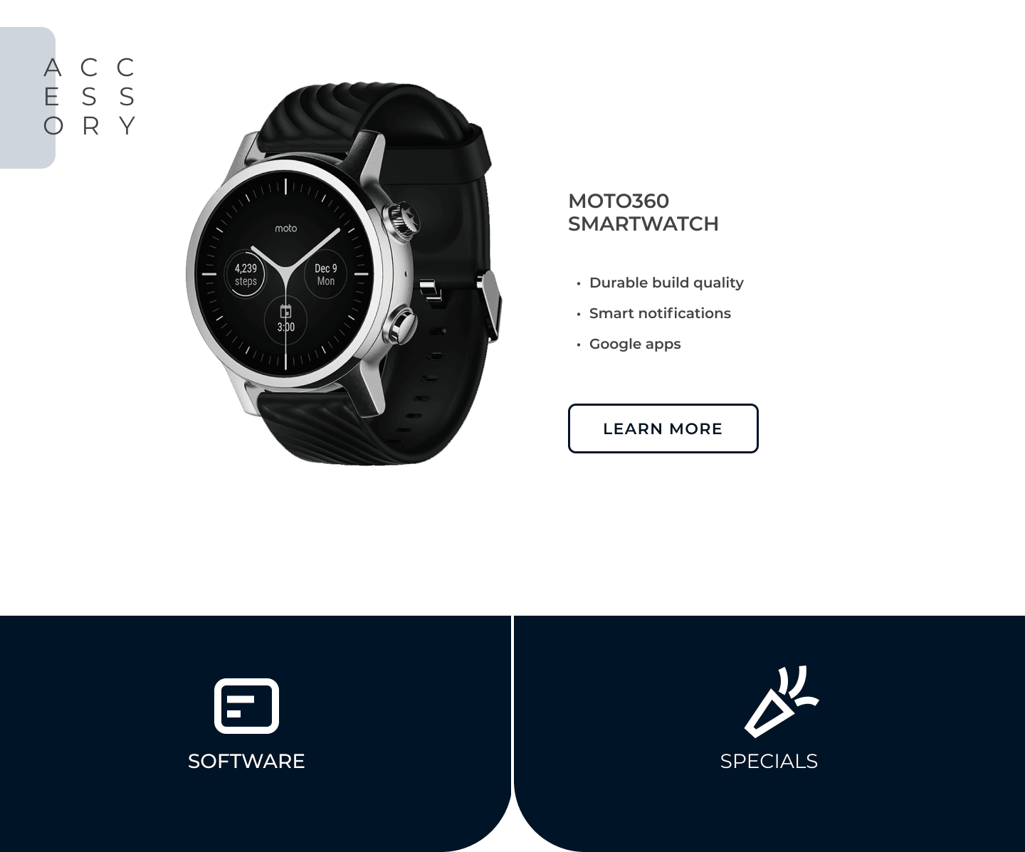
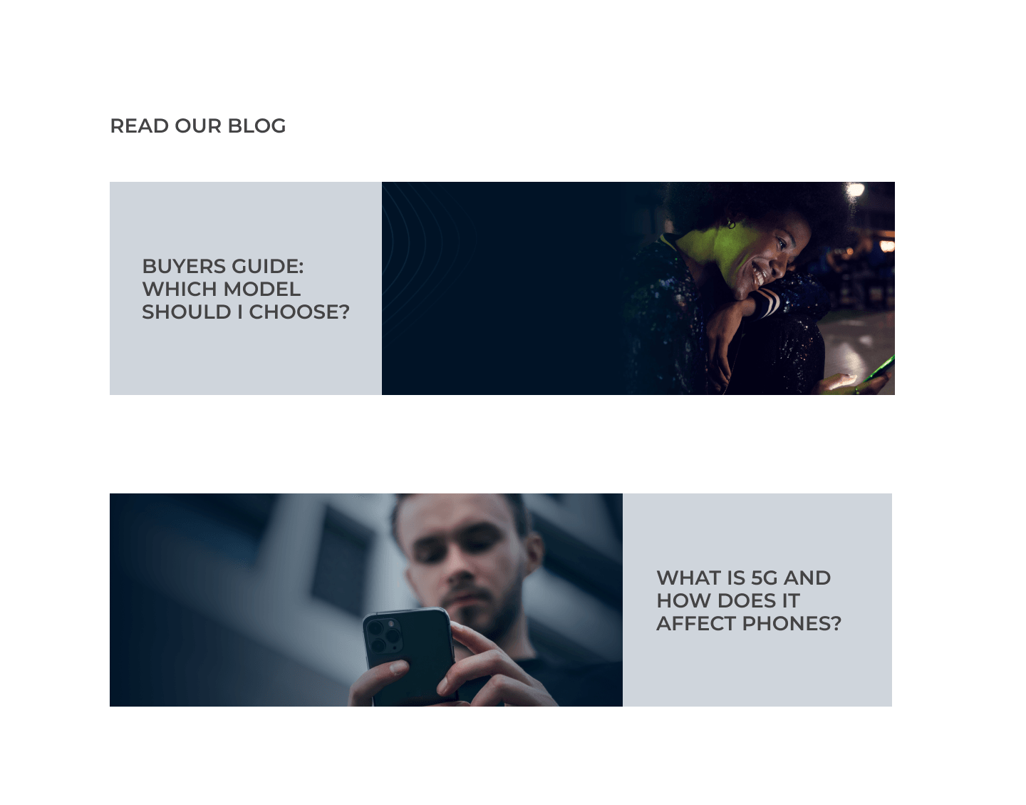
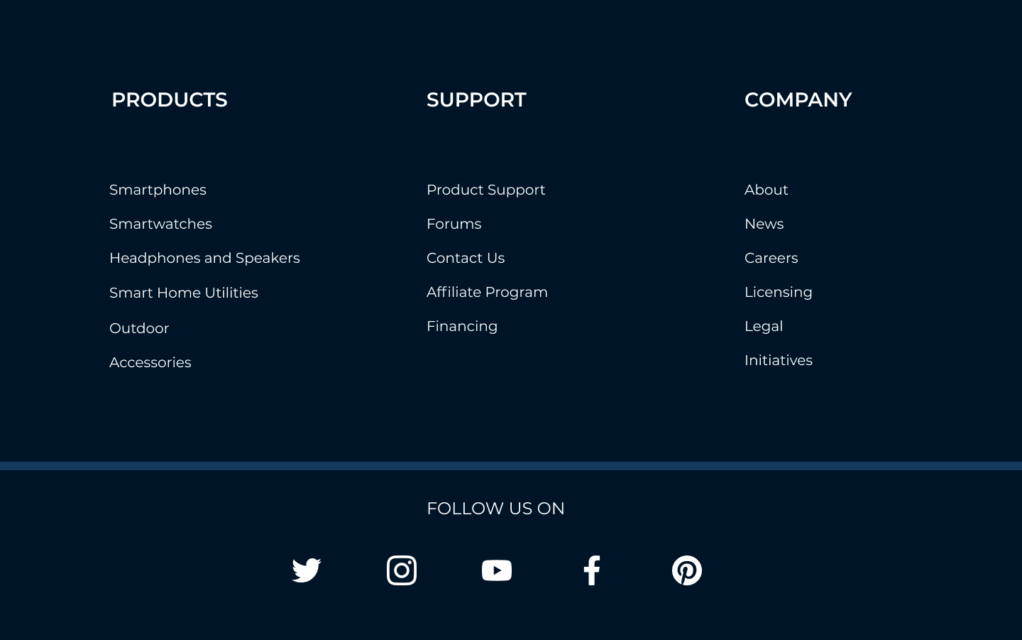
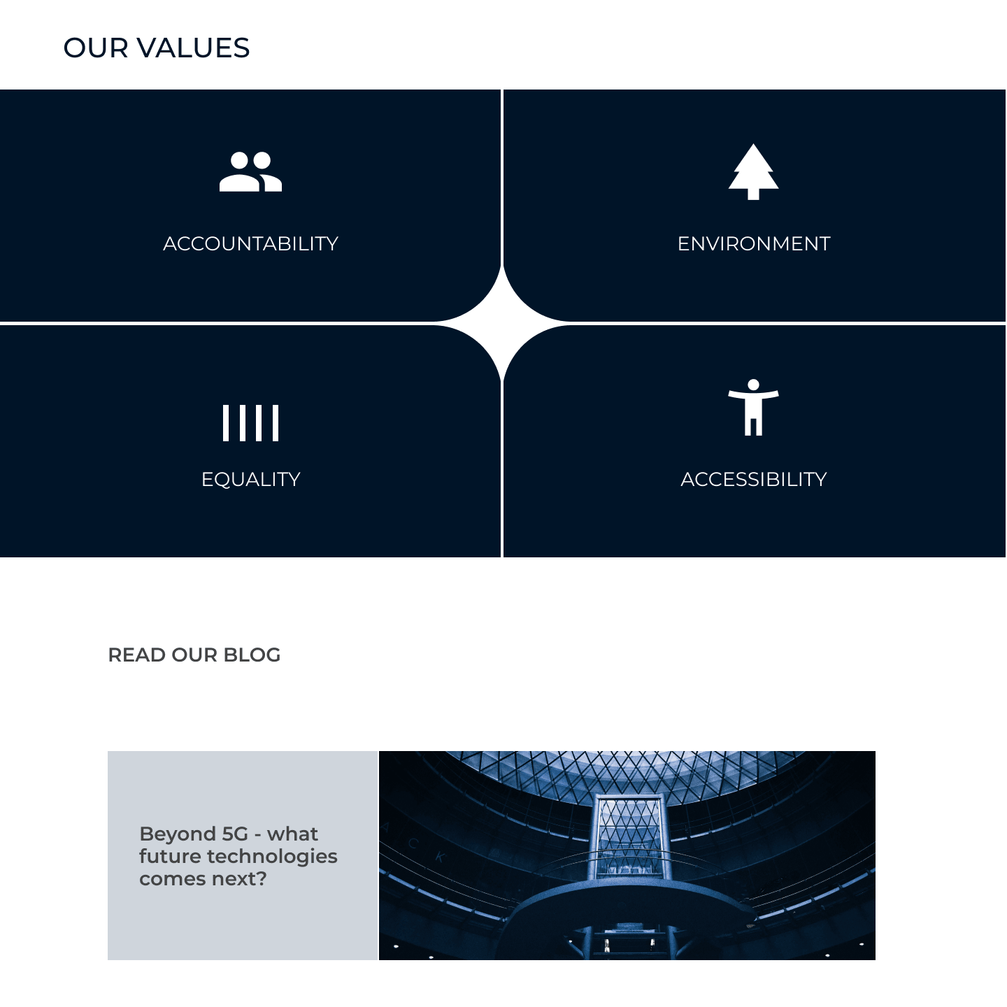
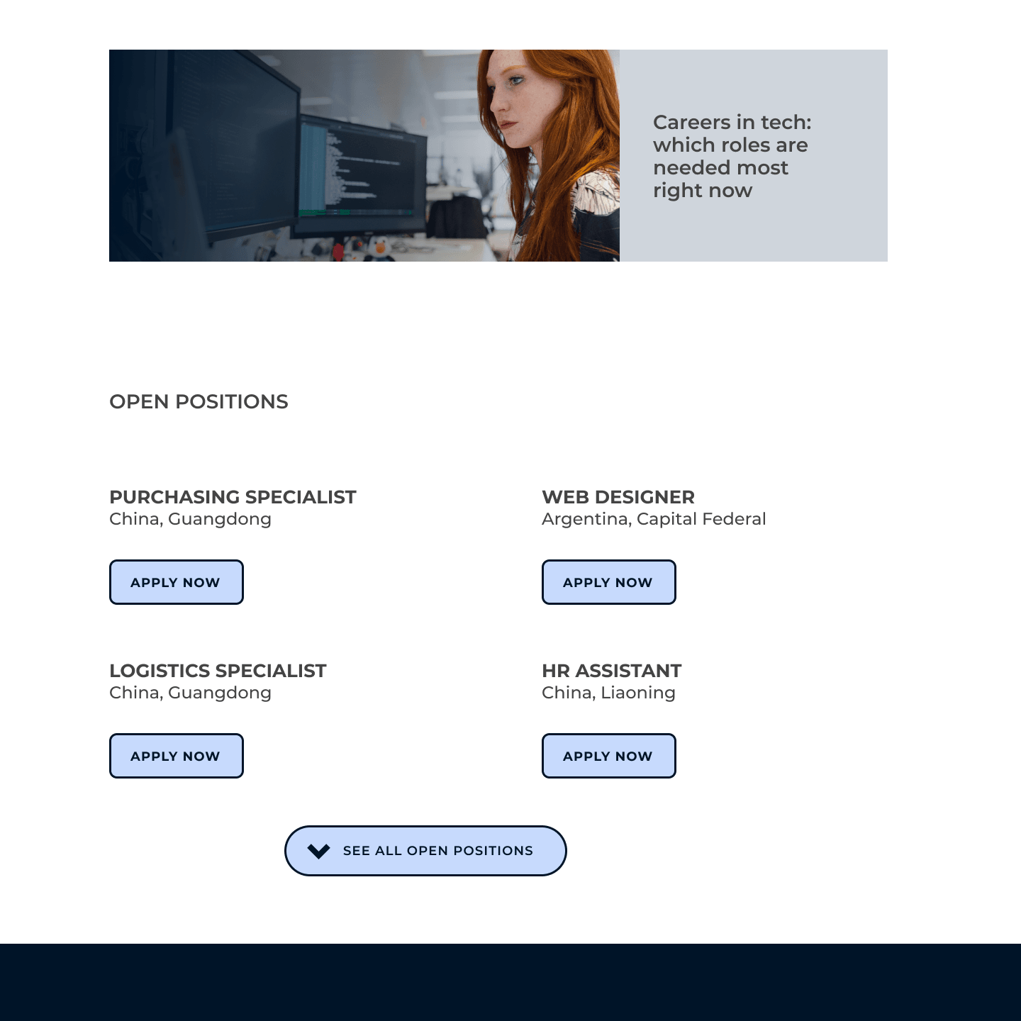
To improve the experience, I've arranged some of the content to be on their own pages for better SEO and to help findability for all use cases. By having a more streamlined experience with emphasis on products and benefits makes it more likely that customers find it useful. These changes also introduce a better information architecture for the site as whole as all category pages can be optimized to customers specific needs.
Results
Currently the design would need to go through AB testing to gather feedback and help tweak it further. As a whole, my subjective experience is that it is less complex in nature and highlights what is important. In terms of UI, it is a matter of positioning and what the companys business strategy is. That being said, there's a reason why most top services on the web adhere to the 'dark text on a white canvas' -rule. So perhaps the question to ask as a business owner is that what does you customers appreciate and expect?
+100%
More happy web designer
Need help with your business?
Send me a message or call me directly and let’s figure out how we can improve your business.
Contact me